If you have used Plotly even just a handful of times, chances are that you have encountered the load screen that offers the age-old advice “correlation does not imply causation.”

Click the link on that load screen, and you will land on this site. There, a simple comic reaches into the correlation and causation cookie jar.

An increase in sales can’t directly be attributed to a new marketing startegy, just like cheese consumption can’t directly be attributed to death by tangled bedsheets (despite the graph below!). A “correlation means causation” argument needs to pass further testing, analysis, and study.
Harvard Law’s Tyler Vigen authored Spurious Correlations, a “ridiculous book of charts” involving bizarre correlations. For fun, we plotted some of the goofiest ones we could find. If you’ve got an interesting find, tweet it @plotlygraphs.
These interactive graphs were made using Plotly’s web app. To securely share graphs and data within a team and make interactive dashboards, sign up for a PlotlyProfessional plan or contact us about Plotly On-Premise.
1. Californian Sunlight and Visitors to SeaWorld
Sunlight in California conveniently dipped in 2010, aligning itself nearly perfectly with a reduction in visitors to SeaWorld. The Californian sunlight minimum was related to a drop in the Pacific Decadel Oscillation.

2. Sour Cream Consumption and Motorcycle Deaths
A correlation means causation argument might be more believable if the title was “attempting to consume sour cream while riding a motorcycle.”

3. Death by Tangled Bedsheets and Cheese Consumption
Of most concern: Why has death by tangled bedsheets increased by over 200% between 2000 and 2009?

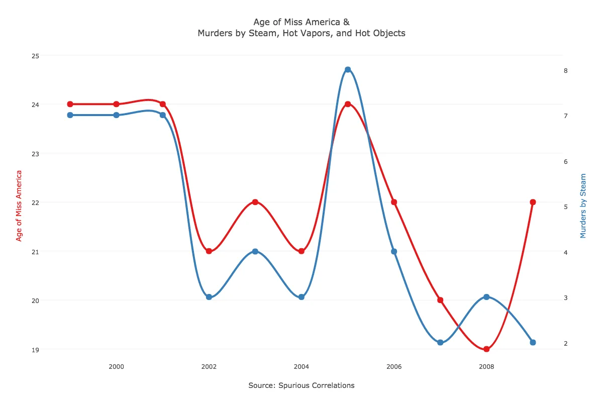
4. Age of Miss America and Murders by Hot Objects
The relationship between these two from 1999 to 2006 has the wow factor.

5. Honey Produced by Bees and Drowning
A decrease in honey production in the U.S. is better correlated with how harsh the winter is — not the number of folks drowning after falling out of a boat.

6. Money Spent on Pets and Death by Stairs
These two things have independently increased at alarming rates.

7. Juvenile Arrests for Marijuana and U.S. Crude Oil Imports
Preferably, both of these are much lower come 2020 — let the spurious correlation continue!

8. NYC Precipitation and Chicken Consumption
When its dry in NYC, folks are outside enjoying the sunshine, not indoors eating chicken!

9. Superbowl Points and Death by Venemous Spiders
Despite a loss, the Panthers scored 29 points in this thrilling back-and-forth affair. Even spiders got excited.

10. Saudi Oil and Banana Cost
Not even a banana oil salesman could convince someone of a real correlation here.

If you liked this post, please consider sharing. If you’d like to learn how to make these graphs, visit our website or check out our tutorials. We have tutorials that show you how to make and embed graphs in your website, blog, or apps. To learn more about how companies are using Plotly Enterprise across different industries, see our customer stories.