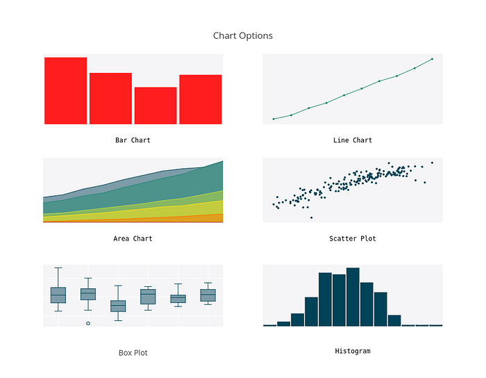
Visualizing data makes it easier to understand, analyze, and communicate. How can you decide which of the many available chart types is best suited for your data? Use this guide to get familiar with some common graph types and how they are used. We made these graphs with our free online tool; contact us to use Plotly Enterprise on-premise.

1. Bar Chart
Bar charts compare values between discrete categories. A quick way to check whether your data is discrete or continuous is that discrete data can be counted, like number of political parties or food groups, while continuous data is measured, as in height or sales. In this example from a Reuters/Ipsos poll, race (the category) is on the x-axis, and the percent of respondents (the value) is on the y-axis.
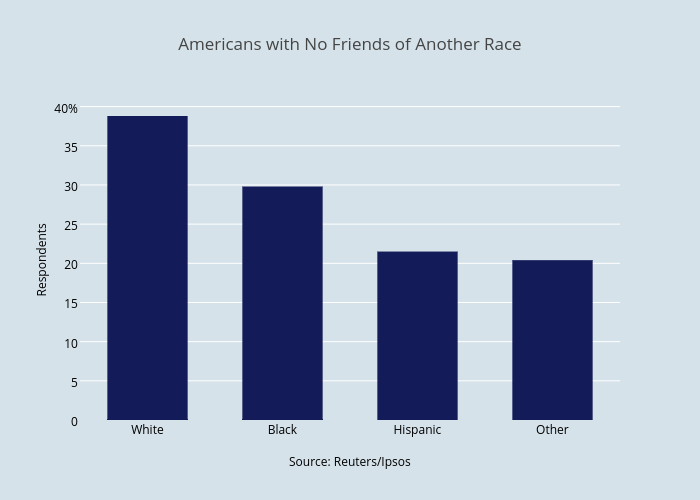
If the data has more than one value per category, a stacked or grouped bar chart lets you see individual values and compare across categories. For example, almost 40% of white Americans are exclusively friends with other white people.
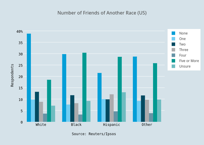
The individual values of each bar are still easy to read in the grouped bar chart, and comparing values is intuitive. The stacked bar chart is ideal for comparing the sum of the components for each group.
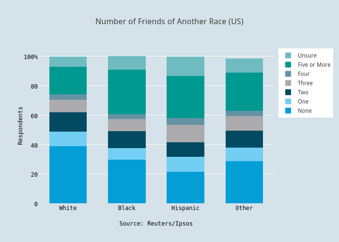
In this case, the stacked bar chart isn’t useful for comparing totals because the percent of all respondents adds up to roughly 100% for every category. If you’re less interested in the individual values, this chart type can give a clearer impression at first glance. You can read more in this tutorial about stacked and grouped bar charts.
2. Line Chart
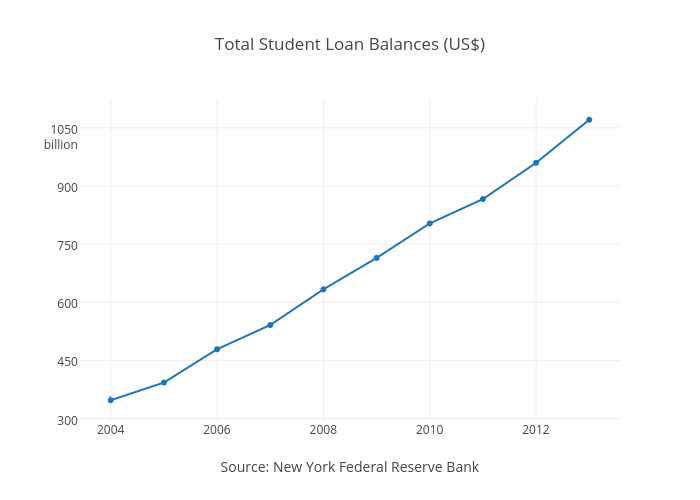
Line charts are similar to bar charts in that they compare values, but the x-axis displays continuous, rather than discrete, data. Each data point has an x and y value and is connected by a line. This basic line chart shows the total American student loan debt over time, with the year along the x-axis, and the amount of debt along the y-axis. Line charts emphasize the overall trend or pattern of the data.
You can compare multiple traces on a line chart. This graph is made from the same data, but broken down into age group.

It can be tricky to choose between a line and bar chart when comparing values over time, as time can be represented as continuous or discrete. Check out the same data plotted as a bar chart. Notice that this is a more effective example of a stacked bar chart, as the total debt for all age groups can be compared between years.
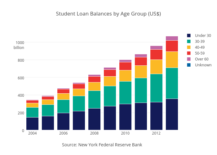
The stacked bar chart makes it easier to see the total amount of debt, while the line chart shows the trend for each age group separately. Line charts excel when the changes are more subtle or vary a lot over time. In this case, you don’t need the pattern-emphasizing power of a line chart to see the steady increase in student loan debt.
3. Area Chart
Area charts are very similar to line charts, but the area under the line is filled in. This simple visual difference can be an effective way of drawing attention to the magnitude of difference between traces, or the cumulative value over a period of time. However, it can be confusing if there are many overlapping traces.

Here, all the information from the line chart is preserved, but use of color draws attention to the volume of debt for each group. In this overlaid area graph, the areas are translucent and placed in front of each other. A stacked area graph adds each trace on top of the last one, such that the areas will never overlap.
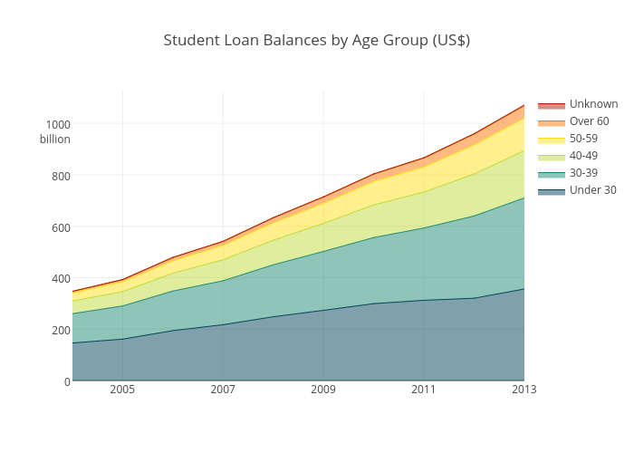
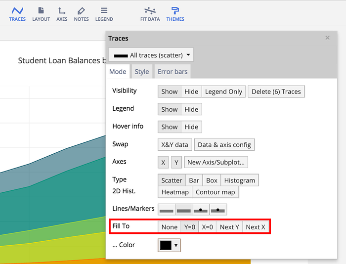
Stacked area graphs have the benefit of showing the total of all the groups, but make it difficult to see values and patterns for the individual traces. Switch to stacked area charts by making sure your data is cumulative and then hit ‘fill to next y’ on the mode tab under traces. Fill to Y=0 makes an overlaid area chart.
4. Scatter Plot
Scatter plots show the relationship between two variables. Typically the independent variable is plotted on the x-axis, and the dependent variable on the y-axis. With this data from Gapminder, a country’s GDP per capita is plotted on the x-axis against the CO2 emissions per capita on the y-axis. The distribution of the data points will tell us what the relationship between the two factors is.
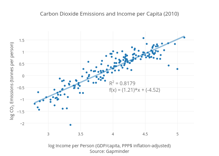
Glancing at the scatter plot indicates that as a person’s income increases, their CO2emissions generally do as well. The line of best fit gives a more exact understanding of the relationship by picking the best slope and y-intercept to fit the data. The R2 is a value between 0 and 1 that measures how closely the line fits the data. If there was no relationship between GDP and CO2 emissions, the R2 value would be close to 0. An R2of 1 indicates perfect correlation.
5. Bubble Chart
A bubble chart is a scatter plot that includes a third variable. This third variable is represented as the size of the data point, creating the bubble. Adding another variable can help your data tell a more complete story. This bubble chart uses the same data as the scatter plot, but now the dot size is proportional to the total carbon emissions of the country. The fourth variable shown here is continent, represented with color.
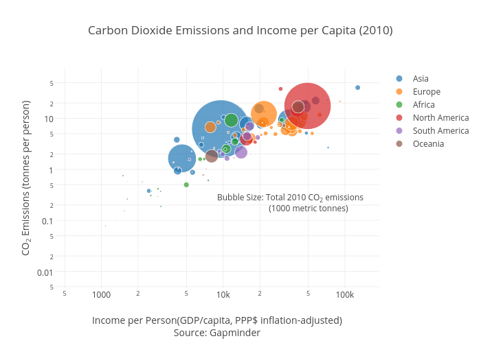
This chart can lend insight that wasn’t available with the scatter plot alone. For example, although Qatar has the highest CO2 emissions per person, the entire country doesn’t contribute nearly as much to global CO2 as China or the United States. If your bubbles range in size a lot, it might be hard to see the smallest bubbles, and the largest bubbles might obscure the surrounding data. You can make some adjustments on the mode tab under traces.
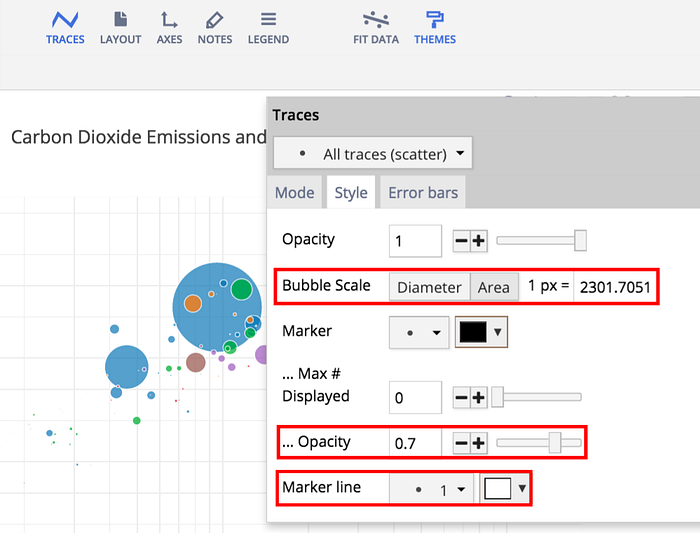
Changing the bubble scale will make all the bubbles larger or smaller. Decreasing opacity and adding a marker line will help make bubbles that overlap with others more visible.
6. Histogram
A histogram shows how data is distributed by dividing the range of values into bins and displaying how many data points fall into each bin. It is visually similar to a bar chart, but with a histogram the bars touch to emphasize that the ranges are continuous data. In this chart about the age of world leaders, age has been divided into 5-year bins on the x-axis (age between 30–34, 35–39, and so on). The frequency is read on the y-axis.
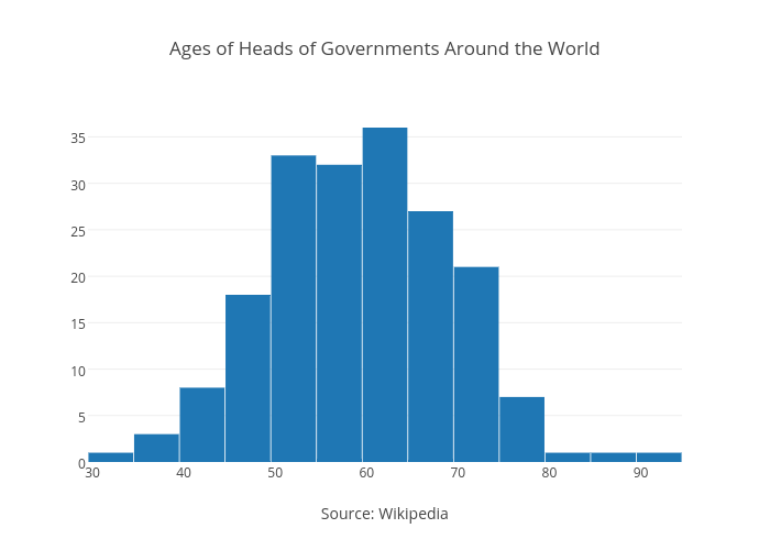
The peak of the histogram shows that most heads of government are around 50–65 years old, and the tails trail off more or less symmetrically to indicate normal distribution. A histogram really shines when there is either very little or a lot of variation in the data. It will clearly show multimodal or uniform distribution. A box plot is more likely to average out these differences and allude to normal distribution. This intro to histograms gives an animated explanation.
7. Box Plot
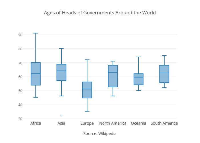
A box plot indicates distribution by dividing data into quartiles. The following box plot is made from the same data as the histogram, but divided by continent. Using Africa as an example, the median age of government leaders is 62. The two quartiles (that form the box) are 53.75 and 70, which means that half of the data points are found within this range. The “whiskers” show the minimum and maximum of 45 and 91. Any dots outside of the box and whisker structure entirely are outliers.
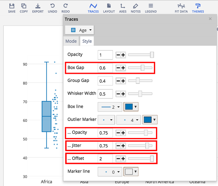
You can also add in the individual data points to a box plot. Under the mode tab of traces, select ‘all’ for the show points options. Switching over to the style tab, you can sit the dots beside the box (offset) and spread them out horizontally (jitter). If they still overlap and are difficult to see, the opacity and marker line options are available, just like in the bubble chart. Making the boxes a little thinner (box gap) makes room for your added data points.
A box plot is ideal for comparing the distribution of a series of datasets, like this data for each continent. It is often used to track different trials of an experiment that is run many times. If the trials are exactly the same, a box plot will show the consistency of results. If they vary by a parameter that is being tested, a box plot could reveal trends or patterns. For a more in-depth explanation of box plots, check out this tutorial.
8. Combination Plots
You can combine different kinds of plots into a single chart in three steps.
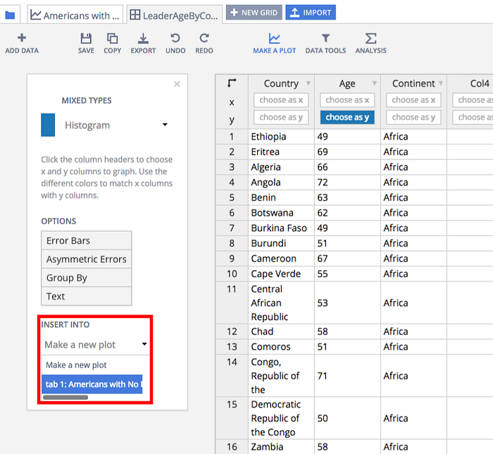
Start by opening a Plotly graph in the workspace. In a new tab, open the data you want to add to the existing plot. Set up your chart options as usual, but instead of making a new plot, select your existing plot under ‘insert into’.
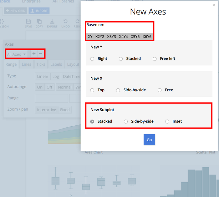
To add a new subplot, go to ‘Axes’ in the main toolbar. Click the plus sign (+) to add a new axis, and then choose one of the options under ‘New Subplot’. Inset will place a small plot inside your existing chart. Stacked and Side-by-side will add the new plot underneath or next to whichever plot you select under ‘Based on’.
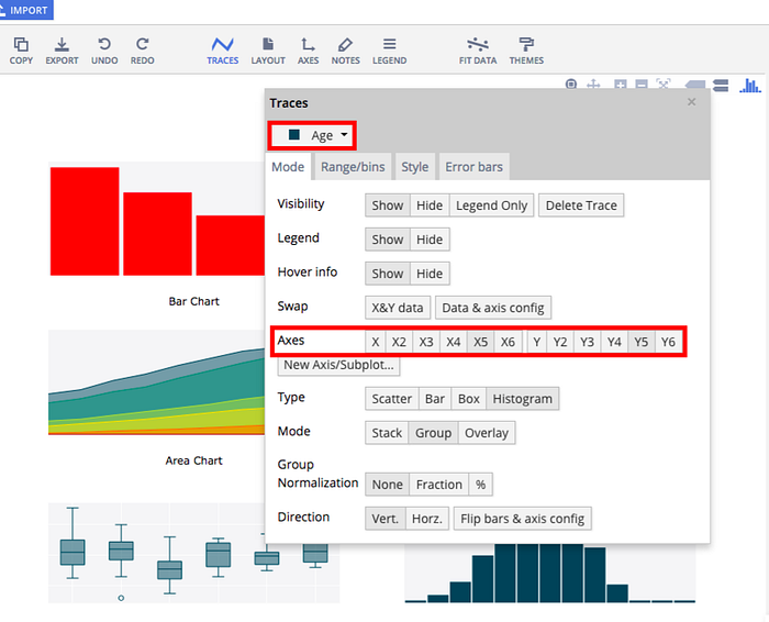
Finally, move your new data over to your new subplot. Click on ‘Traces’, select your new data from the drop down menu, and choose your new axes (X2 and Y2).
If you liked what you read, please consider sharing. Find us at feedback@plot.ly and @plotlygraphs.